
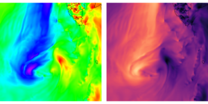
Figure 1: Same wind speed data plotted with two different color schemes. Left: A rainbow palette. Right: The perceptionally uniform palette “magma” in python.
In 2006, a group of atmospheric scientists published a paper with a plot where they used the so-called rainbow palette. In the plot, they had identified three frontal-like features. Later, Sean Davis from NOAA (National Ocean and Atmospheric Administration) recreated the plot, using the same data as the article authors, but instead of the original rainbow palette, he used a palette that became gradually darker with increasing values of the data points. In that plot, one of the frontal features was gone. Same data, different colors, different results!
Choosing colors for plots isn’t just about making it pretty. After all, the whole purpose of data visualization is to uncover patterns that are hard to see by just looking at a bunch of numbers. Therefore it makes sense to choose colors that make plots as easy to interpret as possible. The faster and more effortless it is for a viewer to understand a figure, the wider the audience you reach, and more attention-span is left for your reader to dive deeper into the rest of your message.
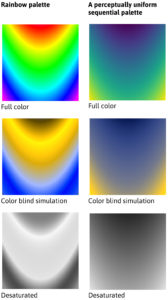
Figure 2: Comparing the rainbow type of palette (left) with a perceptually uniform palette (right) for different situations.
The rainbow palette from the incident above is among the most infamous color schemes that exists. But why is it so bad? First of all, it performs poorly for those who are colorblind. The top left panel in figure 2 shows an example of a rainbow palette in full color. The mid left is the same palette as seen by a colorblind person. There, the whole span from green via yellow to red appears as golden yellowish tone, while the cyan, blue and magenta all becomes blue. Second, the lightness and darkness in the rainbow palette varies in an irregular way that does not match the data values. The desaturated version of the rainbow palette in the bottom left panel has sharp shifts in lightness that have nothing to do with the underlying data. Not only does that make the palette useless for grayscale prints, it also makes it hard to interpret.
You see, colors have three properties (figure 3). First, the value or lightness determines how dark or light the color is. Second, the hue determines the wavelength/place on the color wheel, or in other words, if we call it red, blue, yellow, etc. Third, the intensity, also called chroma or saturation, determines if the color is subdued and dusty/muddy or bright and intense. Zero chroma means grey, while the highest chroma colors will look fluorescent. Among these properties it is the lightness that helps us see shades and shapes. Everyone who draws knows that to make a flat drawing look three-dimensional, they have to add shades in the right places. In the same way we are much more prone to interpret variations in lightness as variation in the data than we are with hue or saturation. Therefore, a color scale like the rainbow palette where lightness varies in a non-uniform way with respect to the data can not only obscure real features in the plot, but even introduce false ones. In the case above, one of the fronts was simply the place where their palette shifted from green to yellow, which also happened to be a place with a big jump in lightness that did not correspond to a similar jump in the data values.
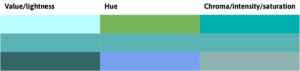
Figure 3: Varying only one property of the color at the time. Left: making it darker or lighter, middle: changing the hue and right: changing the saturation
The solution? Welcome to the world of perceptually uniform palettes! Those are palettes where the lightness varies uniformly with the data. The higher the value in the data point, the darker (or lighter) the color of that point. The variation doesn’t have to be linear, it can be exponential or logarithmic, but it has to be uniform without bands or sudden jumps. See how smooth the perceptually uniform palette in the upper right panel in figure 2 looks, just like the underlying data field. The mid right panel shows that it works fairly well for color blind people too, and the bottom left shows the desaturated version. The sharp edges are gone, and variations in the grey scales still represent variations in the data values.
The best way to vary the lightness depends on the data. Data with a clear order from low to high values, and no obvious thresholds or midpoints, such as wind speed or precipitation are called sequential data. For them, palettes that go from light to dark, like the one we talked about above, work best.
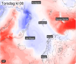
Figure 4: A diverging color palette showing areas of warm (red) and cold (blue) air. Created and tweeted by a forecaster at the Norwegian Meteorological Institute (met.no, yr.no, @meteorologene).
Diverging data on the other hand, is data with a natural and physically meaningful mid-point, such as temperature above or below freezing, or deviation from a median or mean value. For this type of data, a palette that is lightest at the midpoint and gets darker towards both ends is a better choice (figure 4). Different hues for each side of the midpoint helps us distinguish the two sides from each other.
By choosing the hues wisely, we can clarify, highlight and add information. For example, most people associate blue with cold or wet, red with warm or danger and green with “go”, “ok”, or vegetation. If I tell you that figure 4 is a temperature forecast, you will know immediately which areas will be cold on that day.
Unfortunately, not everyone sees hues the same way. About 8% of men and 0.5% of women have some form of colorblindness. If we communicate the severity of an extreme weather event through colors on a map, and 8% of the male population is unable to read the map, we have a problem.
Luckily there are free online color blind simulators and other tools to help us choose the best colors for our plots. In the links below there is more information about how to choose colors for best possible readability, including some tools to help you create a palette that suits your needs. So now when we have the knowledge and the tools, let’s ditch that deceiving rainbow palette and make plots that are clear, intuitive and easy to understand!
HCL wizard
Tool to create different types of palettes, and export then in various formats, see what they look like in greyscale and for colorblind people, and a, useful list of references to scientific literature about color in plots.
Color brewer
Another tool to choose a decent palette
IPCC visual style guide for authors
https://www.ipcc.ch/site/assets/uploads/2019/04/IPCC-visual-style-guide.pdf
Written for contributors to the IPCC reports, but contains useful advices for anyone who want to communicate science through plots.
Blog-post about the 2006-case
https://www.climate-lab-book.ac.uk/2016/why-rainbow-colour-scales-can-be-misleading/
#endrainbow
Twitter Campaign for better color choices in scientific plots
About color blindness
https://www.colourblindawareness.org/colour-blindness/types-of-colour-blindness/
 0
0
 0
0 0
0 0
0 0
0 0
0Matilda Hallerstig
Latest posts by Matilda Hallerstig (see all)
- How (not) to lie with colors - May 2, 2022
- Google Images can be a treacherous friend - November 22, 2021
- Improving weather forecasts in the Arctic - May 2, 2019